Designing the Burrows + Gaskill Letterpress Invitations
I've had a letterpress for a couple years now; I absolutely love the thing, but rarely do I get the opportunity to put it to good use. Luckily, I've got four siblings, and [thusfar] they've all asked me to (or I've convinced them to let me) design and print their wedding invitations.
The process of designing something for the most important day of someones life is a bit daunting in and of itself, but that task becomes
even more so when that "someone" just happens to be a member of your family. In such situations, a part of me thinks: Gosh, if these don't look good or
I screw this up, I'm gonna hear about it for the rest of my life.
Maybe I'm being a bit dramatic, but I take this stuff kind of seriously. And there's always (no matter what the project) a little part of me that wonders if I can produce something I'll actually be proud of — something that I know others will think is as good as I think it is. That kind of worry occasionally weighs heavy on my mind, and I think it might have been a bit of a hindrance in the early stages of this process. Let me explain…
Frustrating Beginnings
When the time came to begin work on my sister's invitations, I was eager but a bit hesitant; it took me a while to get fully motivated to begin, because nothing spectacular was coming to mind — everything I created in Illustrator or Photoshop looked awful, and no amount of pixel-pushing seemed to help. Normally, when a design doesn't seem to be working, brute force over a period of time — trying every different thing I can think of — eventually seems to get it to a point I'm satisfied with, but that just wasn't happening this time.
I went through half-a-dozen different mockups, and each new one was just as bad as the ones before. I wasted countless hours (days, really) on things that I hated. I'm pretty opinionated about design — either I love it or I hate it — and, I hated everything I produced.
Running out of time, I finally decided to begin work on something completely different than anything I had mocked-up to that point: a hand-drawn, flowery design. Things started out promisingly, but after finishing it up, I decided I hated it. It was unoriginal, rough and not very "wedding-y" for lack of a better word. Another two days wasted. This was, by far, the most frustrating design process I had been through in a long time (of course, the fact that I don't design nearly as often as I used to (or would like to) probably contributed to this).
After days of tedious failures, something finally clicked, and I had an idea.
A Breakthrough ( AKA: Freaking-A, Finally! ~or~ It's About Time )
The lightbulb finally came on around 11:30pm, two days before I needed to have the design completed. Knowing it could be awesome if done right, but horrible if not perfected, I needed to get approval from the sis before I moved forward. I quickly sketched something up and showed it to her. This was the initial sketch that she said "yes" to:

Looking back on that sketch, I have absolutely no idea why she said yes. I must have talked her into it (I did my best to convince her it would look much better when completed), but that sketch is awful. If the final invitations would have turned out looking like that, I would have been a little embarrassed. Luckily, Emily trusted me, and I began moving forward with new motivation and exuberance.
Long Hours
I've always believed that, if given enough time, I can do anything — I can perfect anything. I think to be brilliant at something, you have to have that kind of confidence. Confidence not just in your abilities, but confidence in your work-ethic and perseverance & persistence. You have to be willing to out work everyone else; you have to understand that perfection and greatness in something come with absolute hard work, and nothing less. Call it cockiness, call it whatever you want, but I think it's absolutely necessary if you're going to achieve great things.
A bit of an aside: John Nunemaker (of RailsTips & MongoMapper fame) has a great article (and a follow-up) that talks about the importance of hard work and how "talent" doesn't really matter if you have perseverance. When you're finished reading my article, you may want to head over there for a more complete thought on this side-topic.
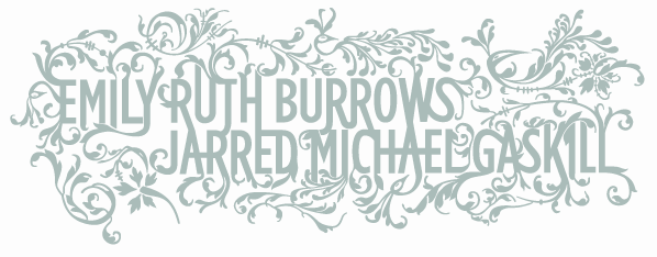
The problem I had with these invitations was that I wasn't sure I had "enough time" to perfect them. Getting things right was going to take quite a while, and I was just going to have to make time — so that's what I did. I went to work immediately, and two long nights later, this is what I had:

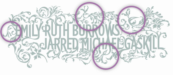
Something I could be proud of. I was proud of both the effort I put into it and the final outcome. But my favorite part about it is something most people probably won't even notice: the peacocks. See, Emily's wedding colors are "peacock colors" (genius, really), and most everything she's done for the wedding has had some sort of peacock connection. I was able to pull four peacocks into the design. Check it out:

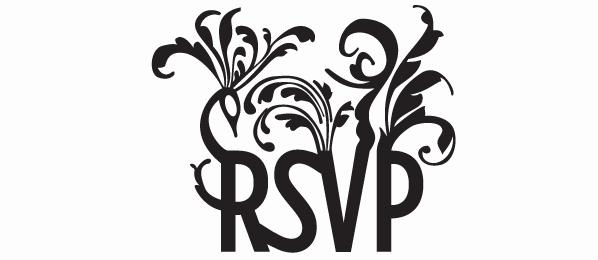
And the artwork for the RSVPs was more of the same (notice the more obvious peacock on the top of the "R"):

The Payoff
Finally, it was printing time. And rather than continue to rant about this thing, I'm just going to show you in pictures how they turned out. Letterpressed with love. Enjoy.


If you want to see more pictures of the invitations and RSVPs, there's a Flickr set up here.
Need Invitations?
If you're looking for custom wedding invitations, save-the-dates, baby announcements or anything else, I'm currently available for hire; you name it, I'd be happy to help. Send me an email at design@philburrows.com, and we can discuss the details of your project.